Featured

Role Models

Throughout my research of the plethora of designers of the past and present, I have found 5 artists that speak to me as important role models in influencing my design choices and future business practices.

Herbert Lubalin – Logos

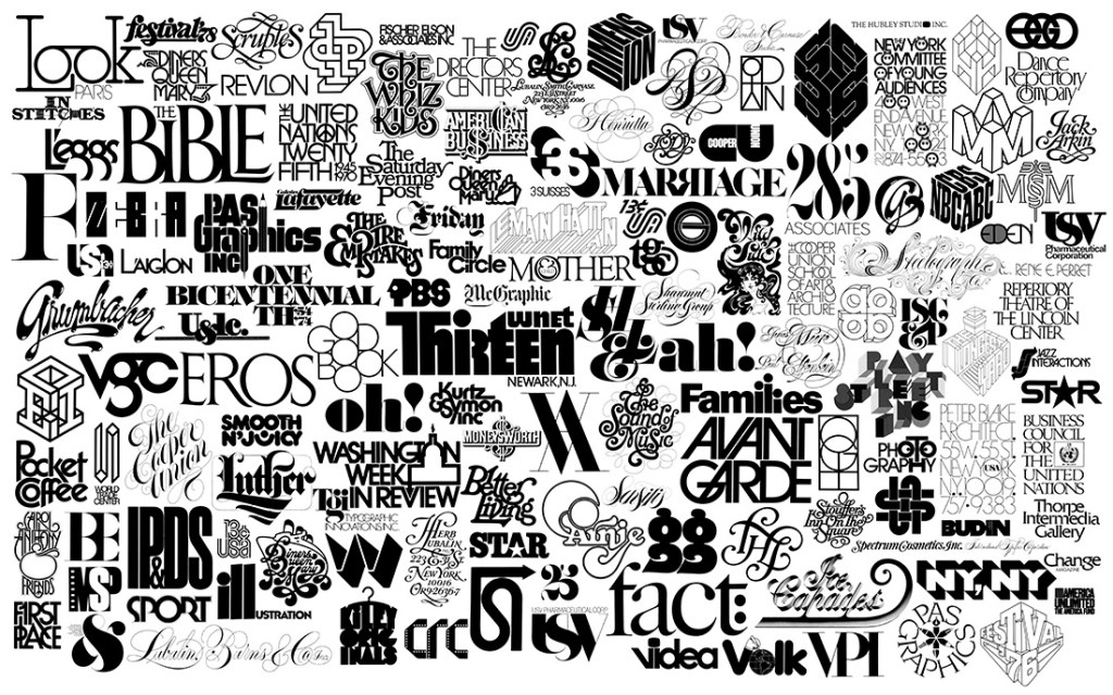
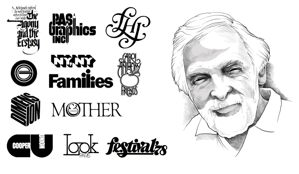
Herbert Lubalin’s legacy is inspiring as his typographic work competes with today’s modern designers. His use of wordplay and genius in manipulating letters to form abstract logos during an era that lacked the kinds of technological advancement that we take for granted and have at our disposal today. The expressive style and techniques used to form his works are what I strive to hone and incorporate in my own work as well as future works. 

Michael Bierut – Hillary Clinton Logo

Another designer that has a skilled grip on the manipulation of text like Lubalin is Michael Bierut, an award-winning designer and an icon in the graphic design industry. His work resembles the modern scope of graphic and logo design. Unlike Herb, Bierut had/has access to more modern tools of designing these works and with that created designs that furthered the horizon of graphical and identity design. While Herb solely made use of different fonts to form his work, Bierut makes use of shapes and further manipulation of fonts to form abstract pieces that clearly portray the identity of businesses to the consumer. His use of color and imagery meshed with abstract typography is another skill set that I aim to perfect in my line of work.

Chip Kidd – Cover art

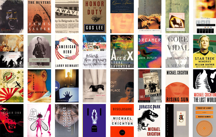
Chip Kidd is another artist that inspires me through his dynamic work as a cover artist. His work makes use of fun and intriguing typography meshed with unique and abstract background imagery to form a unified piece that is visually interesting and summarizes the subject matter to the consumer. The talent of unifying multiple art forms to symbolize a single message is another skill set that I aim to perfect in my work. 

Carolyn Davidson – Nike Logo(Left), Rob Janoff – Apple Logo(Right)

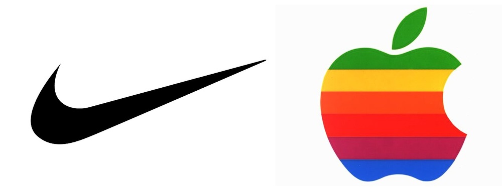
The final two artists out of the five that I researched and admire is Rob Janoff, created of the well renowned Apple logo and Carolyn Davidson’s infamous Nike swoosh logo. Both of these highly skilled artists are known for single pieces of iconic design that have been and are considered household names to consumers and people alike everywhere still to this day. The simplicity behind their designs stands as a reminder that not all creations have to be complex in order to be recognized and successful, sometimes the simplest of designs are all that is needed to convey meaning to a consumer base. This mindset is something I have taken with me and have continued to implement in my work in order to create a concise and tasteful designs language.

Carolyn Davidson

Carolyn Davidson and her Nike Swoosh

Carolyn Davidson’s legacy is another story similar to Rob Janoff’s as she was also an aspiring graphics artist, fresh in the industry looking for her big break in success. That is until an old friend from her days in college requested a favor from her to design a logo for a company that would later rise to become a cultural icon. In her days as a student studying graphics design, Davidson came across Phil Knight, an assistant professor at Portland State University who would later become known as the founder of Blue Ribbon Sports, and in turn, Nike. Knight asked for Davidson’s help on various projects during that time to help her collect funds to pay for her classes. After helping form the Blue Ribbon Sports company, Knight aspired to branch out and create his own brand of shoes but needed a logo to match. That’s when Knight reached out to Davidson and, in turn, birthed what is now known as the most recognized and successful shoe company in the world, Nike. Although her work for the company was priced at only $35 by what is now a multi-billion dollar industry; her talent and efforts done for the company were later recognized as she was granted a million-dollars in stock invested in the company and received a gold, diamond-studded ring featuring the Swoosh design as well as a party and plaque in her honor, acknowledging her as the creator of the company’s logo.

Rob Janoff

Rob Janoff

Rob Janoff began his career as an ordinary graphics designer with a dream to make it big in the industry until one day creating a design that would live as the staple of his career as a graphics artist. His rise to stardom in the graphics industry began after being approached by Steve Jobs and Steve Wozniak; the founders and designers of the start-up company Apple, in turn, creating the world’s most recognized and beloved brand names to be accepted and consumed by society and the tech industry. His method of approaching Apple’s logo design started by adhering to Steve Job’s initial reasoning behind the company’s name. Steve wanted a name that was fun and appealing, something that was simple and not intimidating. That mindset is what Janoff implemented into his design, which formed what is known as one of the most successful logo designs in the graphics arts industry.

Chip Kidd

Chip Kidd and his cover art

Chip Kidd is credited with being one of the greatest artists to contribute to the graphic designing industry. After being hired at the New York publishing house as a junior assistant in the art department at Alfred A. Knopf, Kidd began his expansive legacy by creating complex and engaging covers while also producing freelance work for clients across the publishing world. This translated into the creation of over 70 book jackets per year, which helped boost his recognition across the industry and developed his reputation as a staple in the graphics design community. His innovative and radical design thinking put him on high demand as a cover artist and positioned himself alongside legends in the publishing industry such as Bret Easton Ellis, author of the book behind the controversial cult classic, American Psycho as well as the comic book icon Frank Miller. Many other highly praised and universally recognized authors requested Kidd’s expertise for their book covers because of his extensive portfolio of uniquely ingenious works. Chip, to this day, resides at the Knopf publishing house as associate director and is still creating and innovating in his line of work with the backing of a legacy that granted him a medal of recognition for his contributions to the graphics design industry by the American Institute of Graphic Arts.

Michael Bierut

Michael Bierut

Michael’s story as an upcoming designer soon to be a famous visionary of the late 20th to early 21st century began his journey during the peak of the Post-modernist movement where experimentation flooded the design scene and fueled Bierut’s affinity for new and innovative design styles and typefaces. After acquiring an internship for WGBH and working under AIGA Medalist, Chris Pullman, Michael took from the artistic influences surrounding him to hone his skills as a designer which helped land his first job at Vignelli Associates, one of the most important design firms in the world at the time. There Michael worked alongside legends in the industry which only helped improve and discover his design style. After 10 years he made his way up the totem pole and earned his position as vice president of design their. These titles and accomplishments only expanded Bierut’s reputation amongst the design community. His designs focused on incorporating type in new and abstract forms while making use of the new computerized technology that surfaced in order to create more precise intricate works with ease. By 1990 Bierut’s success and artistic standing pushed him to be partnered with Pentagram, the world’s largest independently-owned design studio and is where he resides to this day.  Michael’s involvement in his community of New York City through being director of the Architectural League of New York as well as a member of New Yorkers for Park has furthered his recognition amongst the public and his devotion to design and its impact on society. These milestones eventually landed Michael in position as president of AIGA till 2001 until being further recognized in the Art Directors Hall of Fame and the Alliance of Graphique Internationale. His dedication to his craft as well as his determination and attentiveness to the influences and artistic movements surrounding him helped grow his persona as a designer and formed him into a staple of the graphics design community.

Herbert Lubalin

Herbert Lubalin – Logos

Being one of the most recognized and famous graphics designers of the 20th century, I wanted to dive deeper into what made Herbert’s reputation so renowned to those in his field as well as outside of it. At 28, after graduating from Cooper Union, Herbert began working as an art director for Sudler & Hennessey’s communications firm. There he held his position for 18 years and, in those years, worked alongside other talented artists and designers, honing his skills and taking inspiration from the creative minds that surrounded him. This talent would not go unnoticed as Herbert was later named Art Director of the Year in 1962 by the National Society of Art Directors. This booming success soon pushed him to further his craft and expand his name by forming his own firm in 1964 to later become founder and art director of his own publication named U&lc (Upper and lower case) that showcased the International Typeface Corporation’s (ITC) typefaces, which he also co-founded. Herber accomplished all this while also teaching at Cooper Union and being color blind. The will power behind his success is something to marvel and be inspired by as well as his mindset of not allowing his misfortune to disable him from creating unique and intriguing works. Instead, he worked around his condition by simplifying the color palette to two- and three-color solutions to bring focus to his letter form and layout. Herbert’s dedication to his craft regardless of the challenges and his willingness to innovate led him to a legacy that brought new age thinking to the table and re-imagined the structure of graphic design as well as being the grandfather of Typographics.